JAM
2017 | Interaction Design, Design Research
JAM is an application that improves the process of discovering local music (in Austin, TX) by connecting musicians and venues.
JAM was a group project. I worked with
Riley Lenz,
Jasmine Oh, and
Kira Street.
My main contributions were in user research, user flows (wireframes), and the final mockups.
Jump to the Final Product
Process
Research
We interviewed a total of 30 people. Our interviewees were musicians, band managers, promoters, fans, producers, and/or venue employees.
Personas
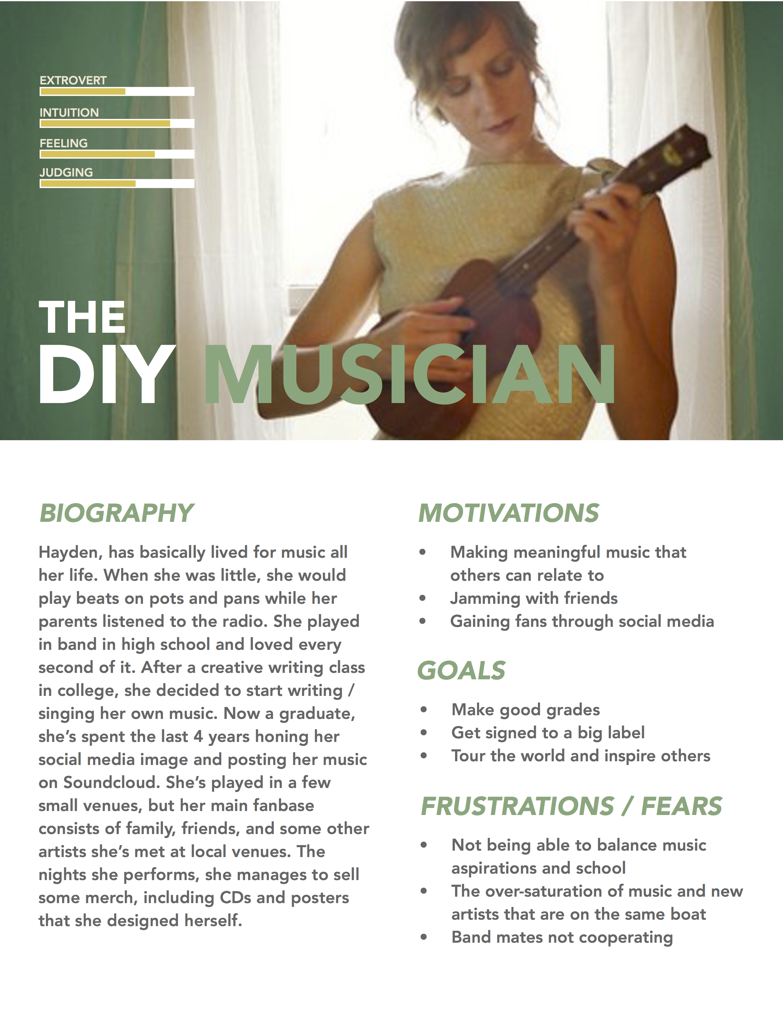
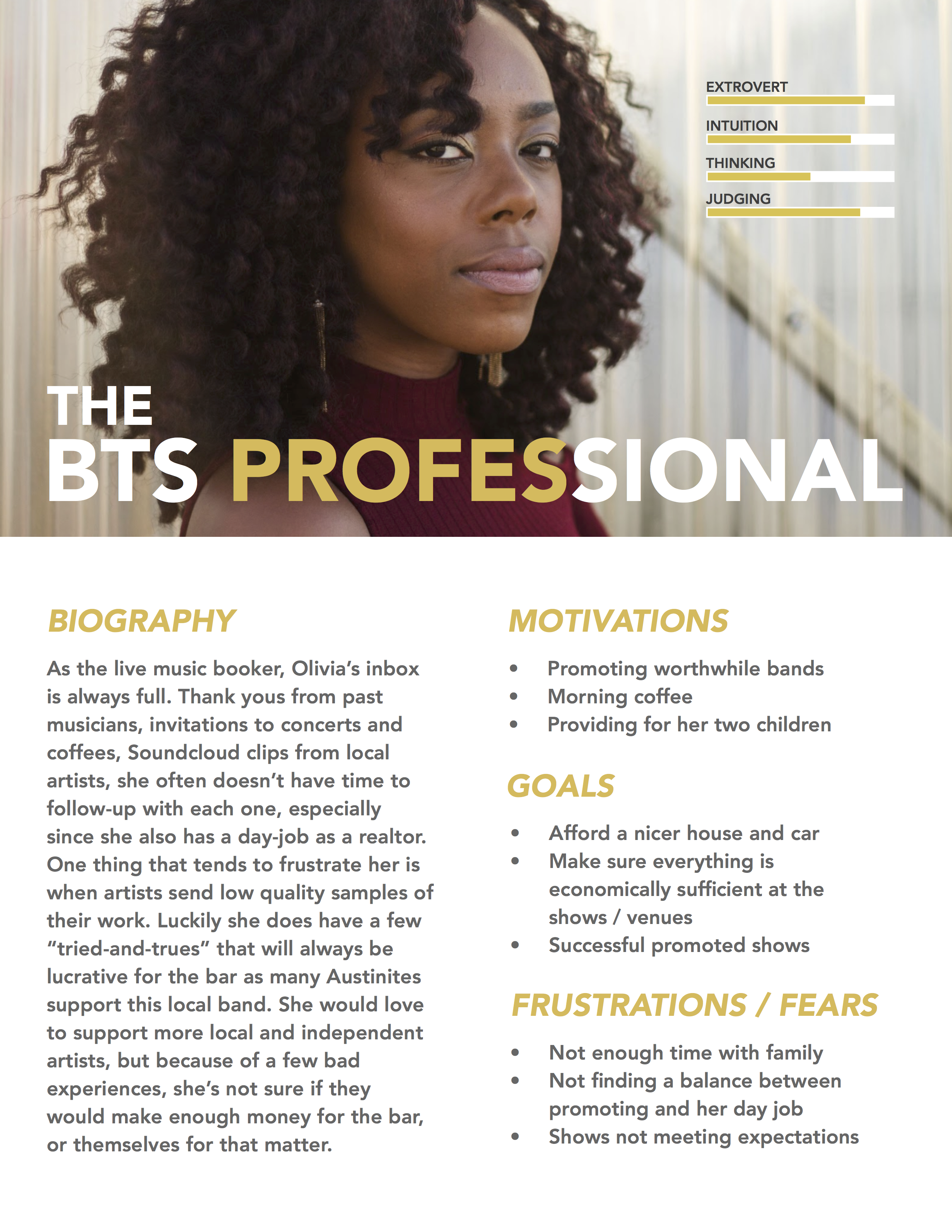
From our research, we developed 4 personas: the everyday fan, the DIY musician, the behind-the-stage professional, and the hobbyist. Ultimately, we decided to focus on the DIY musician and the behind-the-stage (or behind-the-scenes) professional.
Problem Statement
There is a lack of efficiency in communication between the venue and the local musician.
Prototyping
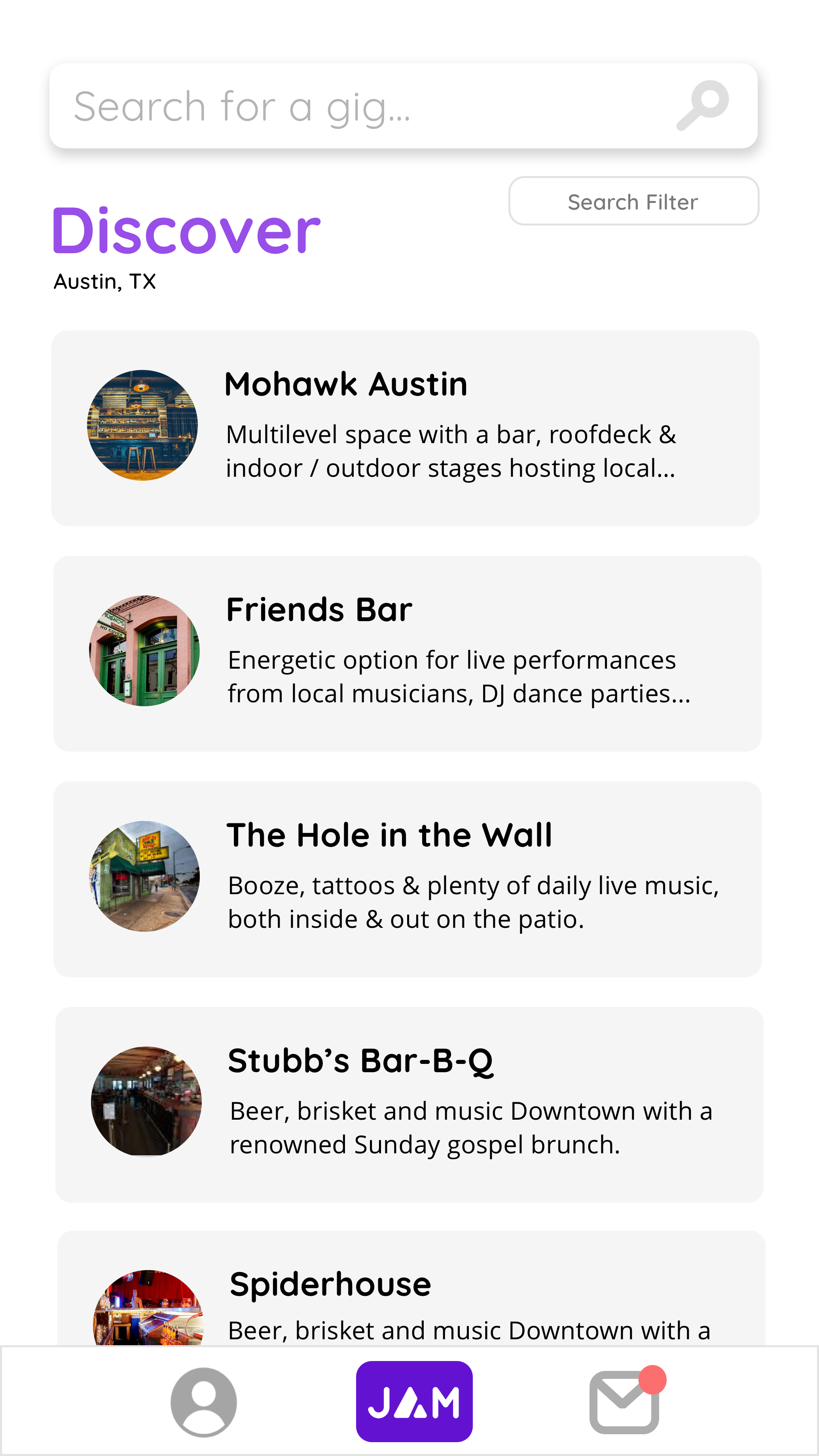
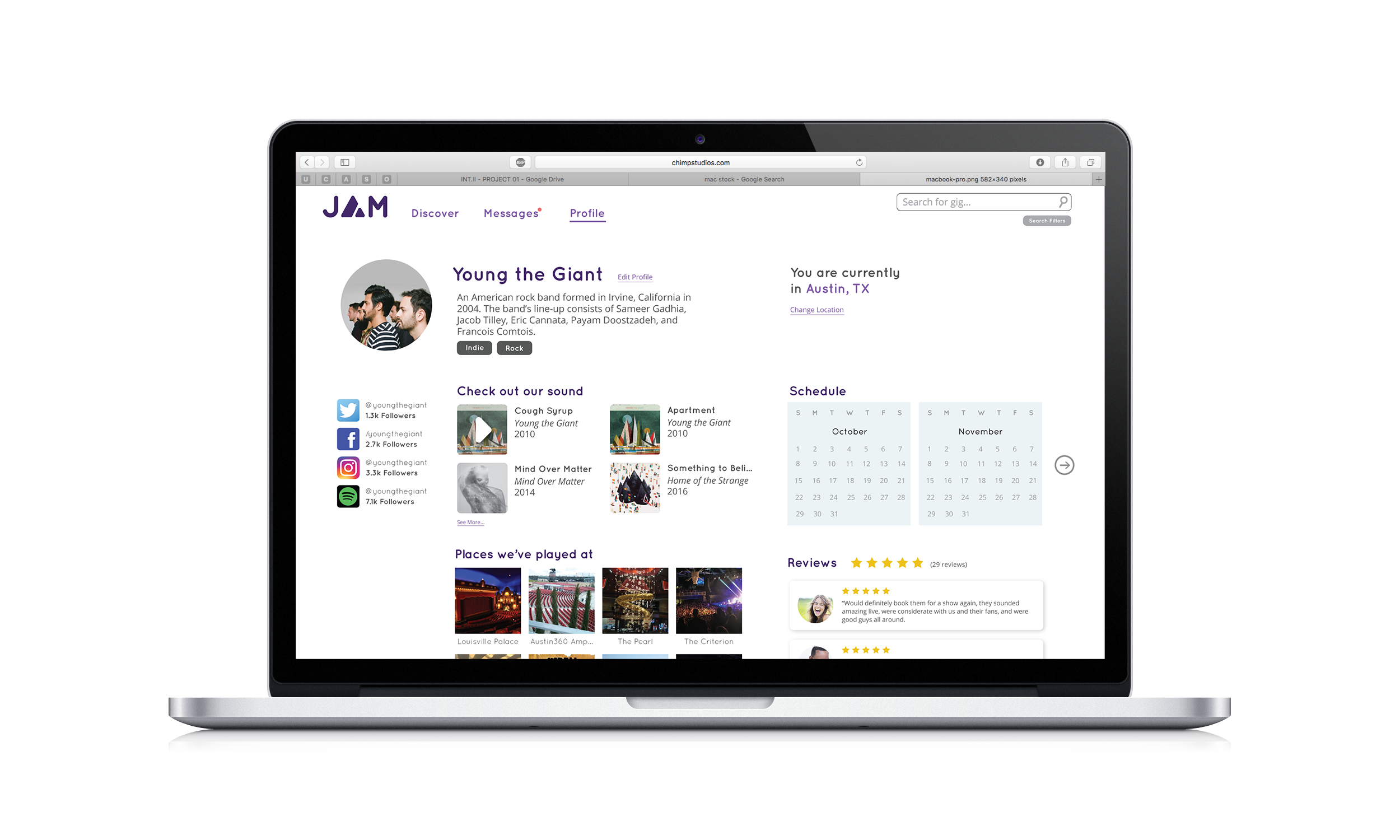
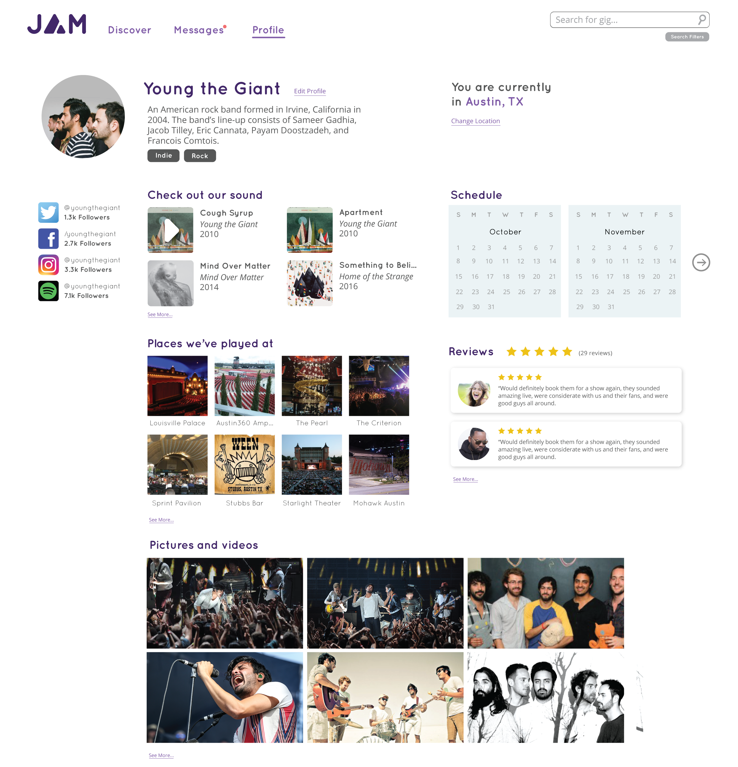
Our solution is JAM, the first step in connecting local musicians and venues.
User Flow
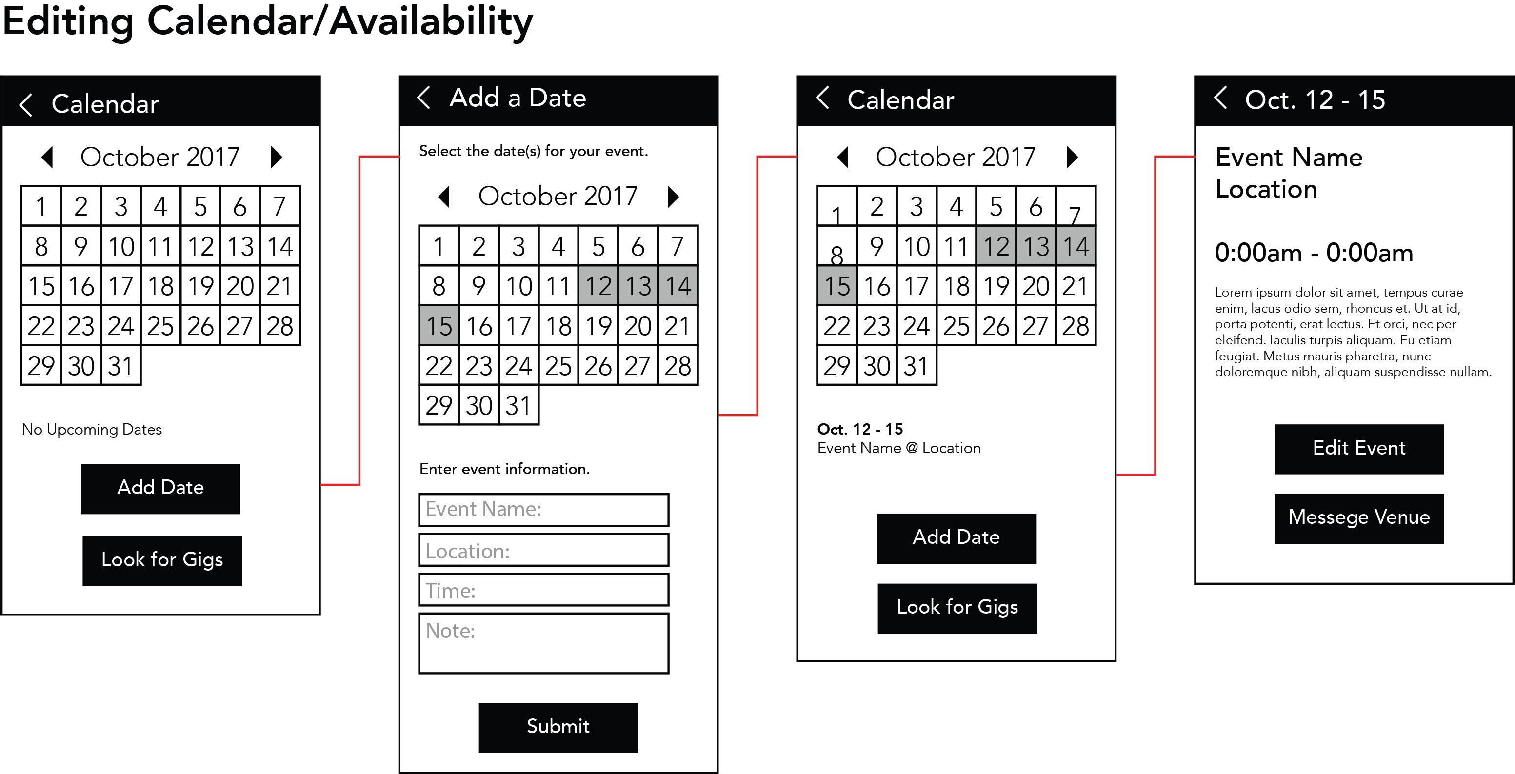
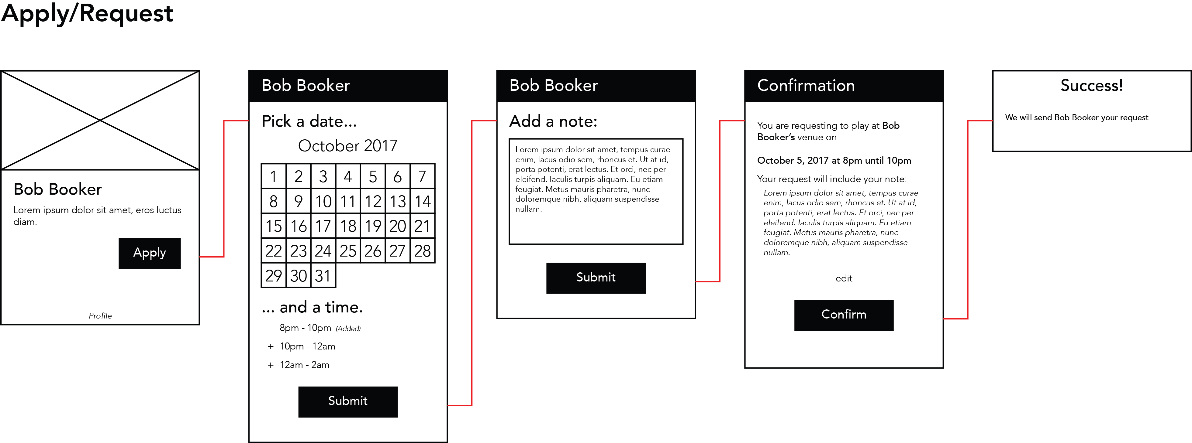
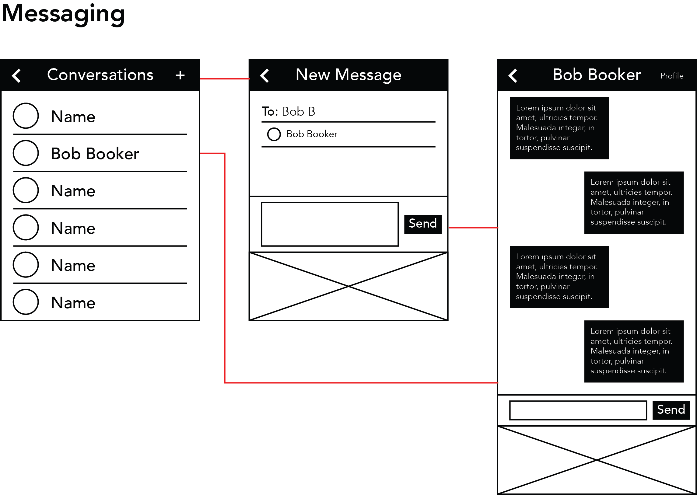
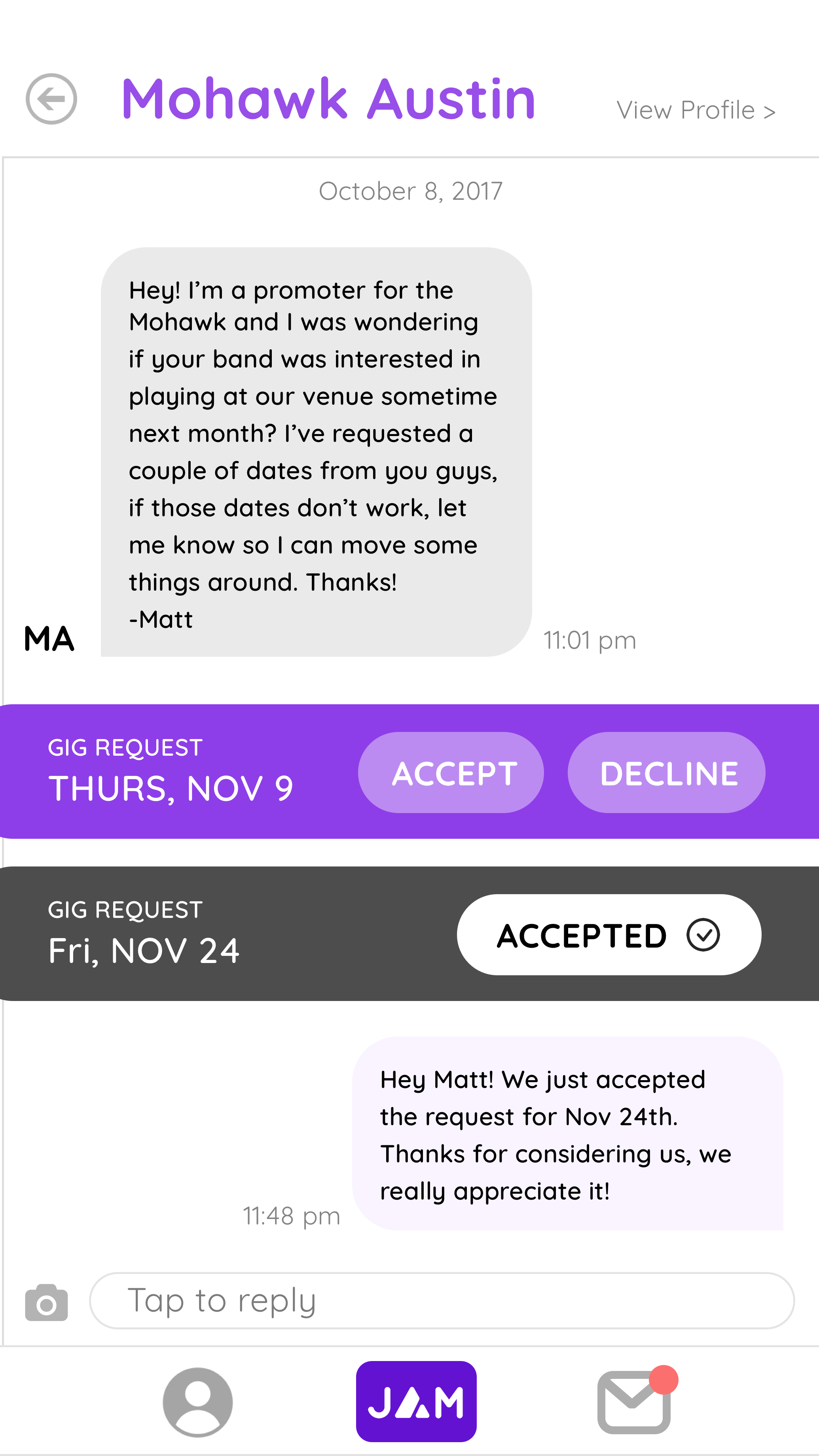
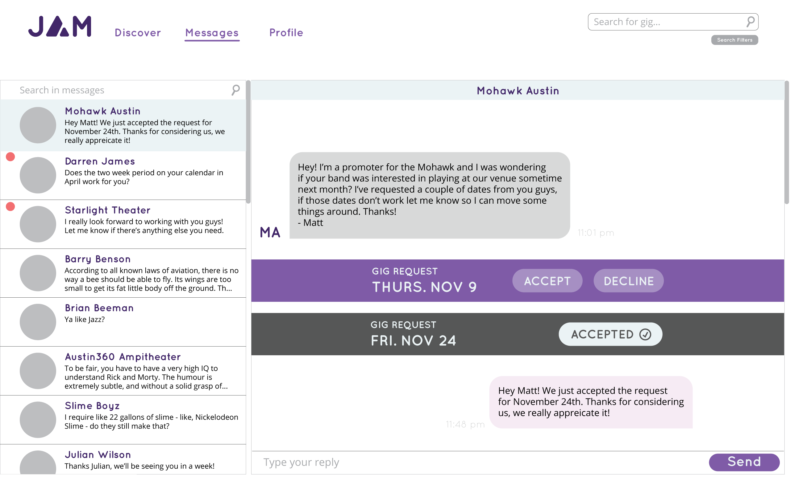
Since our users are musicians and venues, JAM allows users to view the profiles of other musicians and venues and show their availability. When users find a venue to play at or a musician to book, they can apply for or request other users for an event. Since both user types are able to search and request the other, we decided that their user flow in JAM would be the same.
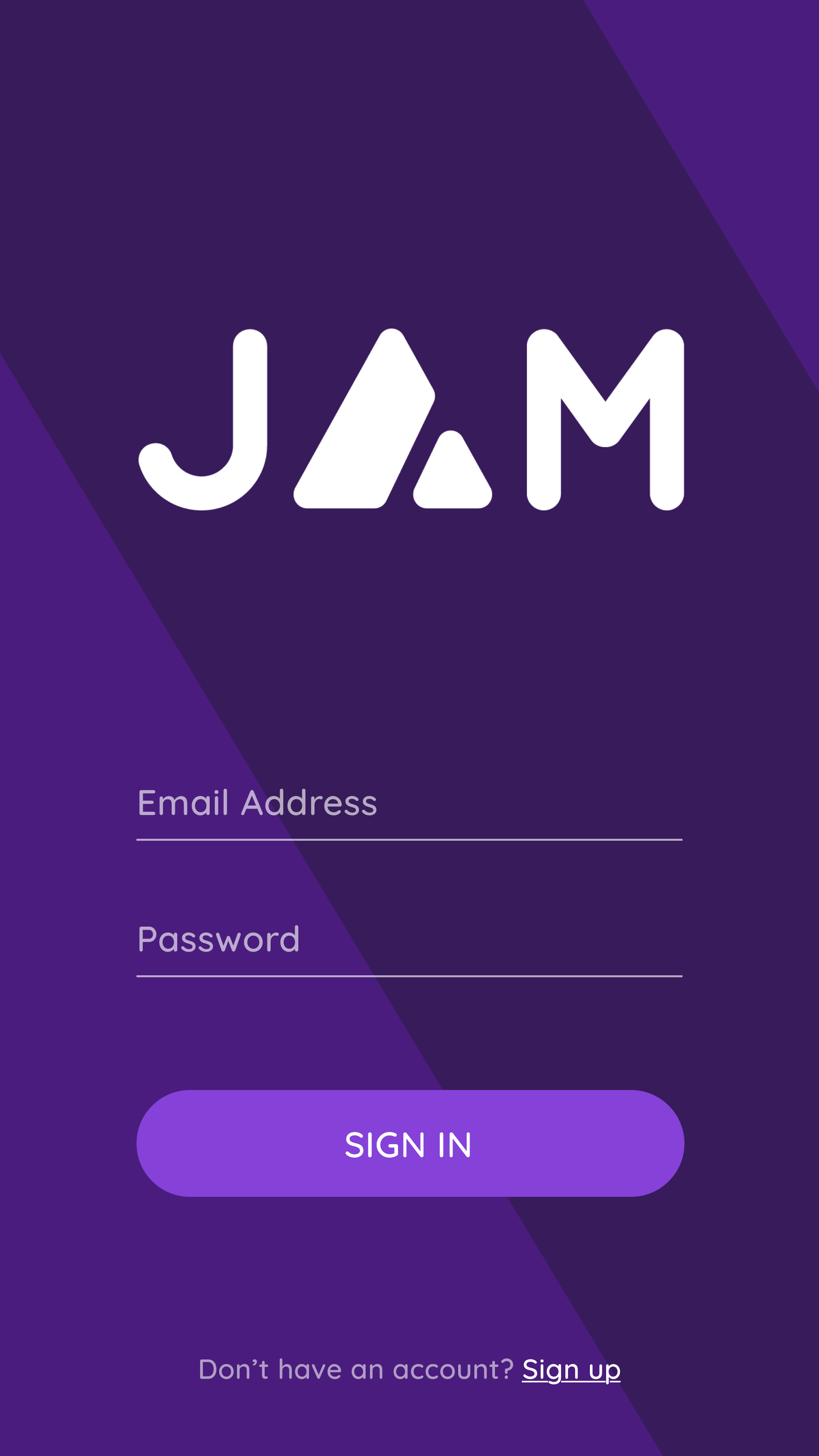
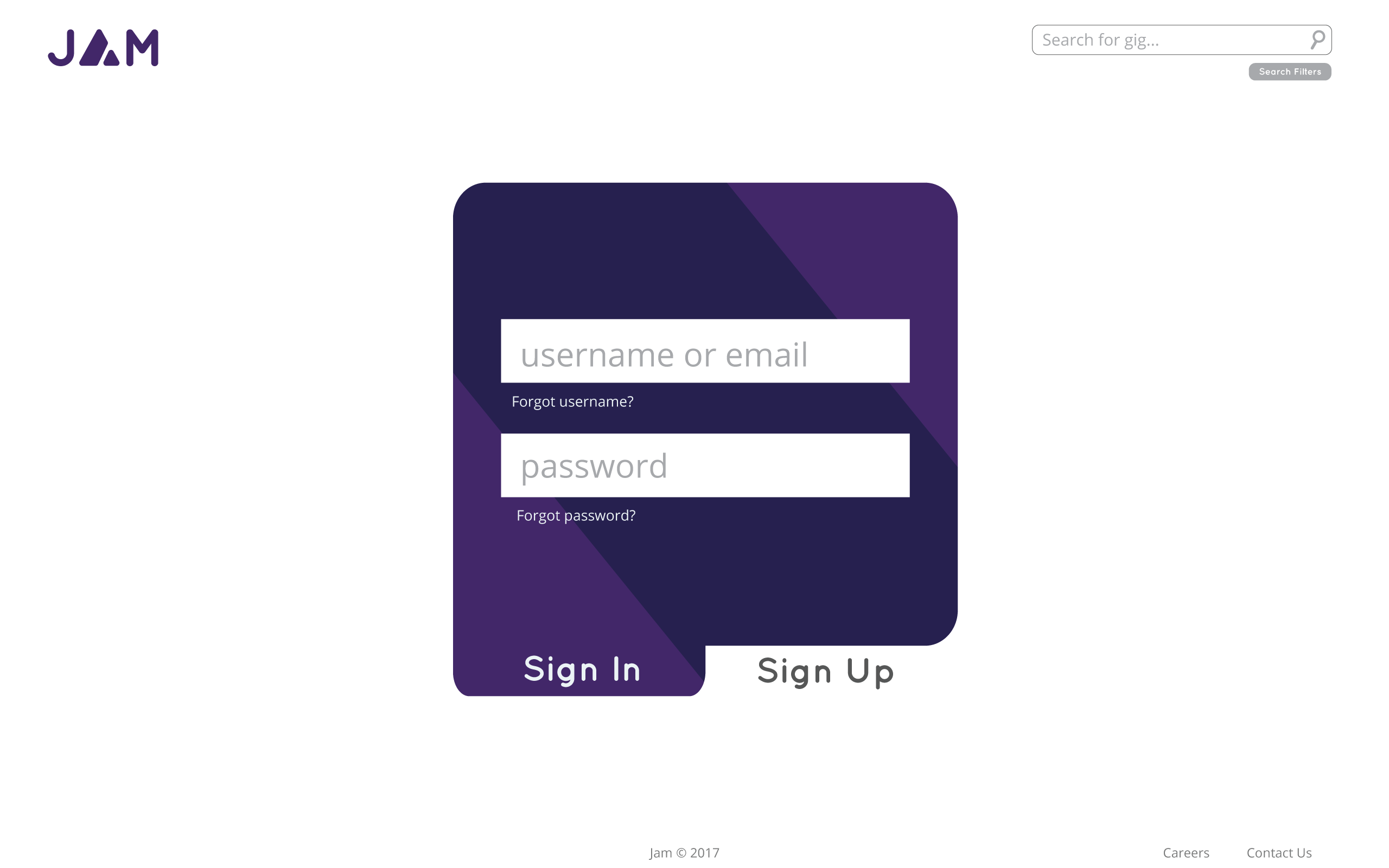
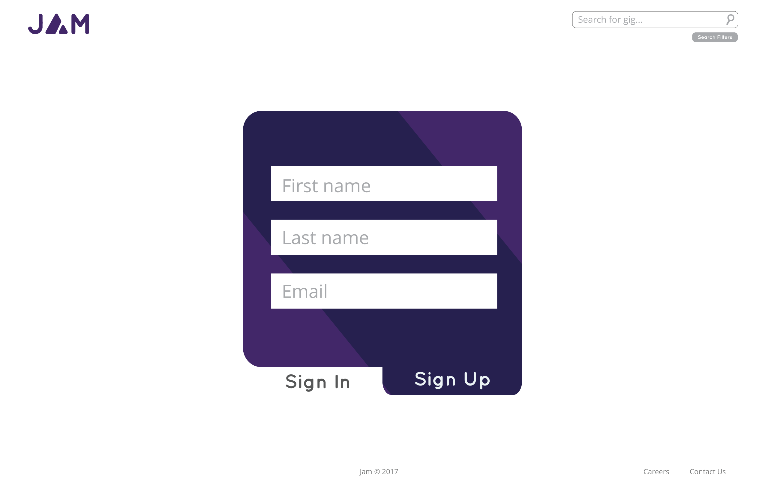
We identified 6 major actions that users would need to use our app: signing up, editing their profile, editing their availability, searching for musicians or venues, applying to or requesting a user for an event, and messaging between users after applications are accepted. The first three focus on setting up and managing a user's profile, while the second three focus on creating connections between musicians and venues. (The wireframes shown are the ones I personally worked on.)
Branding
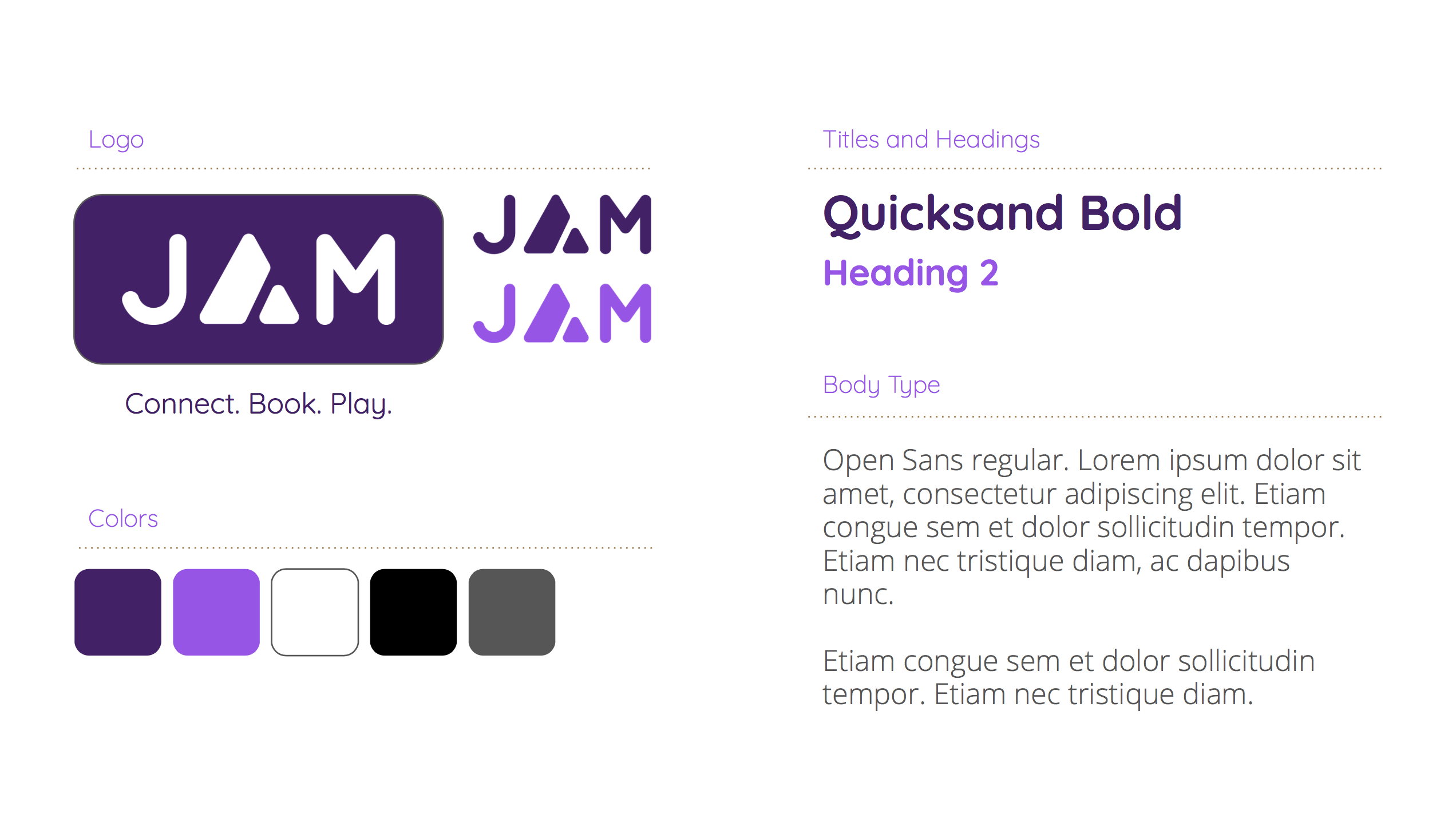
Originally our product was going to be "PR&Jam," a play on PB&J (peanut butter and jelly). We dropped the "PR" because it was an awkward fit for our brand and it was not necessary. "Jam" means a collaboration or, alternatively, a jelly. We chose Quicksand paired with Open Sans for our fonts because they have a "squishy" feel. We wanted our brand to have a "squishy" feel so that it could match the physical characteristics of jam and be more welcoming to users.
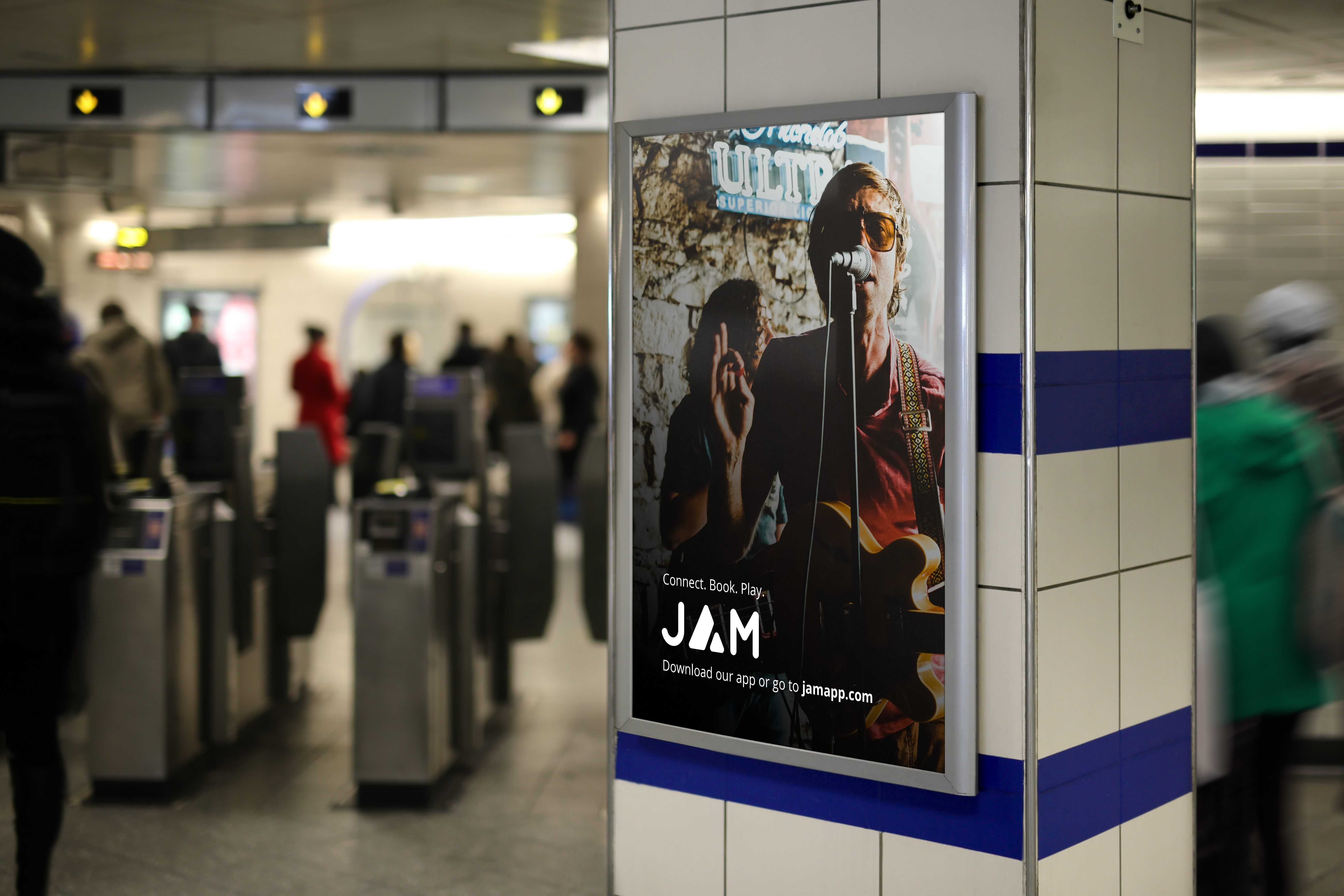
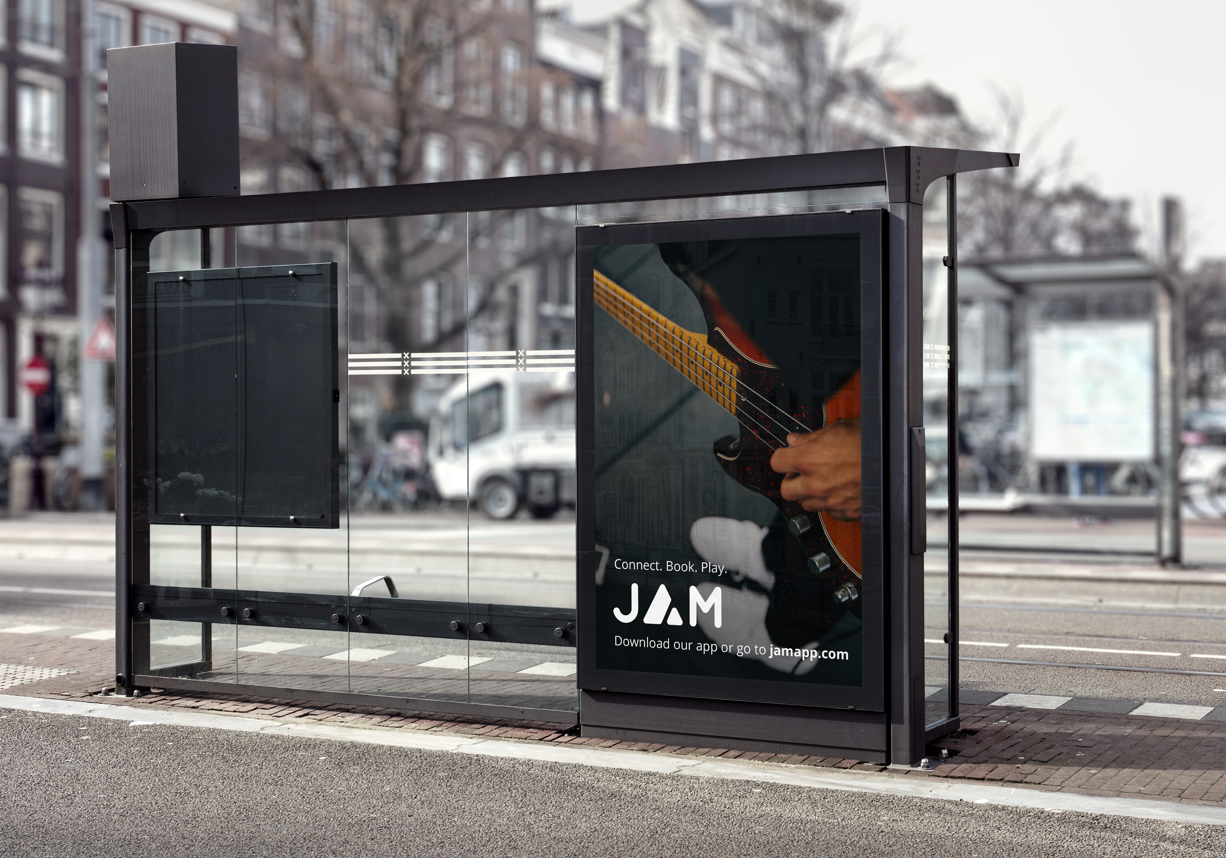
Promotion
Final Product
Mobile
Link to invision prototype
Desktop
Go back to the Process